Tonight let me introduce to our guest blogger, Victor Ayers.

Tell Us a Bit About Your BW experience and why you got into BW?
I have an academic background in Cognitive Science which is the interdisciplinary study of mind and intelligence. The SAP Business Intelligence field attracted me due in part because it involved so many different ways of presenting information in so many subject areas and to a wide variety of audiences, from C-level executives to line workers.
I've worked on nine SAP BW implementations from SAP BW 3.5 to SAP BW 7.3. My last four projects have included SAP Business Objects BI (XI 3.1 & 4.0) with SAP BW serving as the underlying data source. I've worked in the areas of Finance (FI-GL, AR, AP, AA), Materials Management, Sales & Distribution, Project Systems (PS), Plant Maintenance (PM), Flexible Real Estate (REFX), and statistical reporting of the client's landscape. My special area of focus is in dashboarding solutions for
my clients.

I've worked in the Postal, Utilities, Retail, and EC&O industries.
Tell us about some of your hard learned dashboard usability hints?
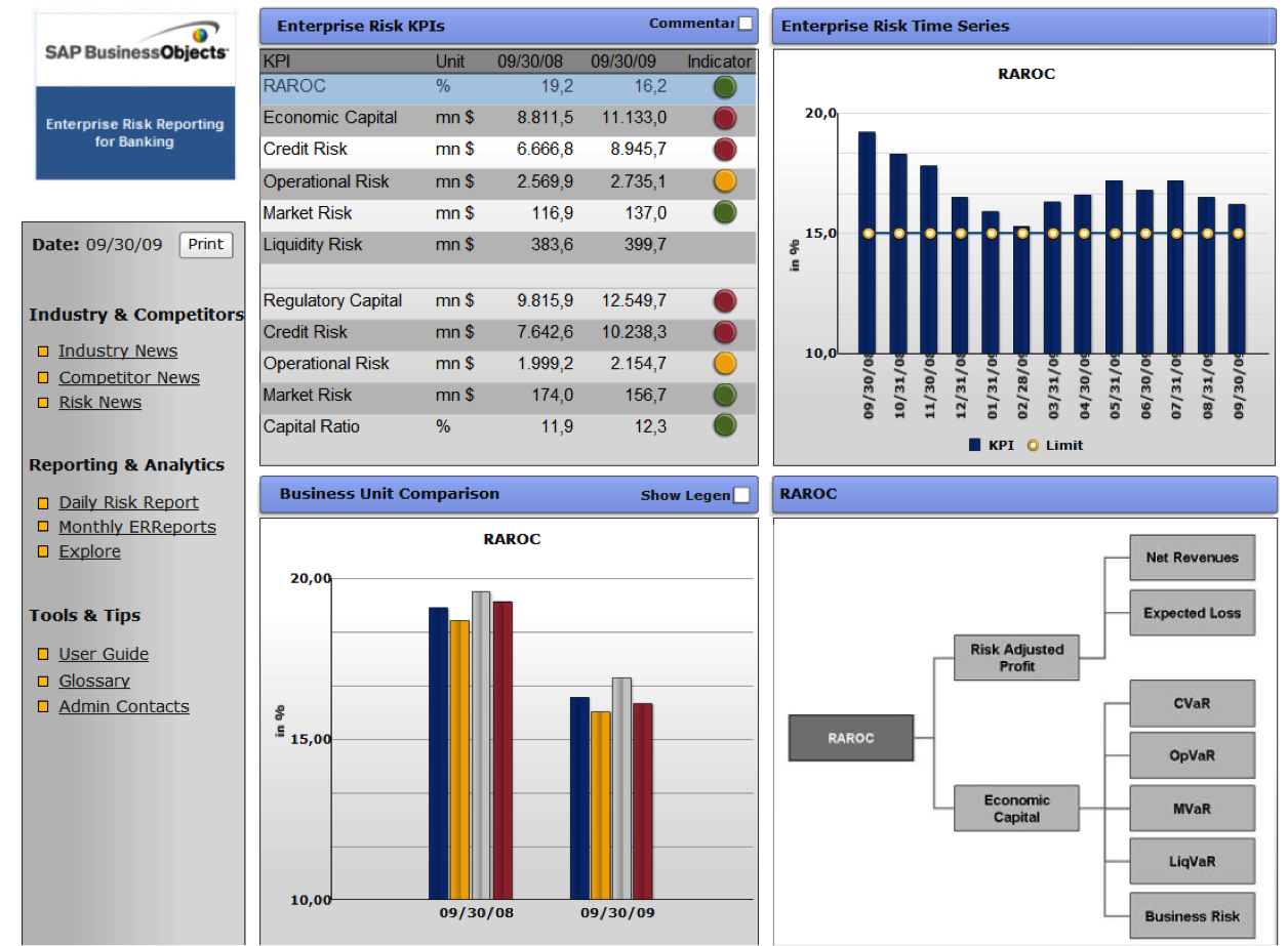
These may be dashboard development best practices obvious to some people, but I run into some of the same issues over and over again. The most common one is clients insisting on using the wrong type of graph or object to illustrate their information. Gauges are one of the most popular objects requested. When used correctly they can be quite powerful, however it is easy for them to become meaningless.
Remember what a gauge tells you in your car, miles PER hour, Revolutions per Minute. When used in a dashboard, these should be used to illustrate a rate. If you are going to use one like a gas tank meter, remember that the gauge should then represent a constant max and min marker. A warehouse has a maximum amount of inventory it can hold. This maximum should be known and form part of the gauges scale.
Do You Have Any Other Dashboard Tips or Dashboard Best Practices
Another common mistake is using a bar or column chart to illustrate a trend. While yes, it may be fairly obvious that there is a trend from viewing a set of bars; the correct graph type is a line chart for illustrating one or more trends. The bar chart with a trend line is also useful when only one trend line is needed.
Other Bar Chart Best Practices
If one of your dimensions is time, it should be on the X Axis. Since time charts flow from left to right. When utilizing a horizontal or vertical bar graph, it is advisable to arrange the columns in descending order based on their highest value, rather than randomly sorting them. With the line graph, charts shouldn't show more than 5 values and with bar charts, it's not recommendable to show more than 7 values.
AI Bar Graphs
While bar graphs are one of the workhorses of data visualization, the advent of Artificial Intelligence and ChatGPT (and many other AI platforms), means you can take Bar Graphs to whole new levels of interactivity and usefulness. For example, you can set up Key Performance Indicators and have their current status displayed in the bar graph. I personally like to add a legend that explains which direction is good versus bad.
Pie Chart Best Practices
Although they are not always the most digestible methods of showing information, pie charts may be necessary at times if the user wants to see detail. Still, they are more digestible than raw data, and their ease of use can be further facilitated through the use of colour.
Although pie charts are common and aesthetically pleasing, they are not a recommended method for visually representing data on a dashboard. Pie charts tend to force users to remember color-information pairs to be able to interpret them.
Line Charts
Line charts are used to show how data changes over time. Typically, the value is represented on the Y-axis while time is shown on the X-axis. They are a great addition to a dashboard since users can easily identify patterns and trends by following the continuous line.
Bubble Charts
Bubble Charts help to introduce the third dimension into charts. Theoretically, if you wanted to, you could do a bubble chart, where each bubble is a pie chart. Voila, your bubble chart can now also show the composition of each bubble. Of course, it's easier said than done, because usually, bubbles vary in their size drastically.
Focus on Data Visualization
Data visualization is the presentation of data via graphics and pictures—its primary objective is to help decision makers identify patterns or understand difficult concepts that may go undetected in text-based applications.
My recommendation is to spend time with your end users and work on the UI/UX design aspects of your dashboard. You will have succeeded when they simply use it without spending time trying to learn how it is supposed to work. Your expertise as a dashboard designer with data visualization techniques will be greatly appreciated when your users have that 'a ha' moment.
Provide Clear Labels
One of the best favors you can do for your end users is to provide clear labels, that are dynamic in nature and know when to appear and where to appear. Don't over do it, but don't leave them guessing.
Another recommendation of mine for clients is to first get their BW system and queries working and validated. The SAP BW system is not a simple plug and play project. The dashboard requirements will drive some of the customization needs of their BW system as well. If the information and data models are ready to go however, the dashboard development process will proceed much more fluidly and quickly.
Conduct Effective User Persona Research
Conduct user persona research is essential to doing initial customization of visual data and ensuring information will meet key user requirements. User research should continue throughout your dashboard design process. Providing customizable dashboards will improve usability and eliminate the need for different user personas.
Great dashboards provide everything one click away. All essential information is immediately accessible. Data is prioritized. Information is displayed clearly in a visual hierarchy on one screen. The design provides a coherent overview that includes sparse, clear initial data with additional drill-down, drill-through and drill-across capabilities.
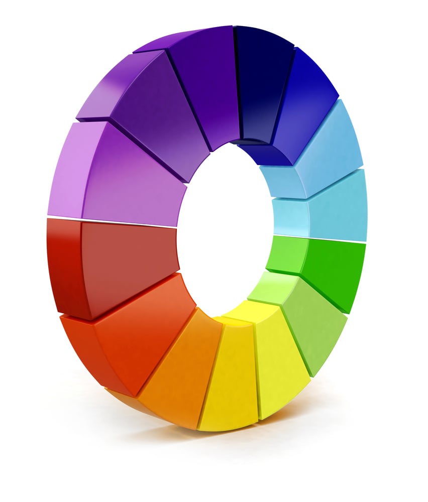
Color Palettes
Great dashboards require research. One of the key areas of research is the usage of color. While most businesses have Brand Books, with brand colors, these probably are not exactly what you need for an effective dashboard color palette.
Additional Color Palette Design Considerations
Does interaction with the dashboard require technical knowledge? Will users manage to accomplish most of the actions in just a few clicks? Does the design align with user context by creating drill-down menus; does it use suggestive iconography and color palettes? The color palette used in a dashboard's design should also be considered as a context. Many business-to-business SaaS product dashboards are designed in a dark-themed UI because they are used for several hours straight.
Chose Your KPIs Wisely
A successful dashboard design is a KPI (key performance indicator) dashboard design. What does this mean? KPIs are metrics used to display a visual representation of the most relevant data based on different areas of your business or brand.
Characteristics of Well Designed Dashboards
Dashboards should help your users to leverage data and improve the performance of their organizations. Well-designed dashboards are easy and intuitive to operate and use. They are user-friendly and action oriented, making data analysis and decision making easy.
Analytical Dashboards
Analytical dashboards provide the user with at-a-glance information used for analysis and decision-making. They are less time-sensitive and not focused on immediate action. A primary goal of this kind of dashboard is to help users make the best sense of the data, analyze trends and drive thoughtful decision making. The type of dashboard you need should be determined by the user roles and needs you to seek to satisfy.
Operational Dashboards
Dashboards used for business intelligence purposes. Their goal is to measure, monitor, and manage operations with a more immediate or shorter time scale.
Strategic Dashboards
Unlike the operational dashboards, strategic dashboards are used for long-term strategies of a business. You use them to look at long term trends, and they often incorporate 3rd party data sources to allow decision makers to evaluate, for example, the state of markets and competitors.
Use Common Building Blocks
If there are dependencies that will affect decisions making within one group of information based on info from another, create a layout in a way that users do not need to go back and forth — create a continuous flow for easy scanning across the dashboard.
Leverage Microsoft Excel
Most of your users have excel skills, often very high levels. While very senior executives may not have as much time to tinker with excel, SAP BW is fully integrated with excel and this gives you great flexibility to design custom dashboards for user type, including executive level strategy dashboards.
Top Ten Dashboard Usability Tips
As a matter of fact I have prepared a list of my Top Ten Dashboard Usability Tips. Click the button to get your free copy.
I would love to hear any of your hints and tips!
People Who Read This Also Read:
- What are 2 Primary Focus Areas for SAP Airline Customers?
- 10 Advanced SAP BW Project Estimation Techniques [Online Tool]
- How To Use Google Keyword Planner Tool Tutorial
- Learn What is Catch Weight Management
- Understanding Embedded Systems vs SAP HANA
- 3 Ways to Design KPIs Using SAP Solution Map Composer
- Learn What Tools To Use To Investigate IS-Mill Functionality
- Leverage SAP BW to Increase Supply Chain Inventory Accuracy
- BusinessObjects Explorer Best Practices
- Take a Deeper Dive into Aircraft Cockpits Vs Dashboards
About SAP BW Consulting, Inc.
SAP BW Consulting, Inc. provides comprehensive SAP solutions, including SAP Business Intelligence (BI) and SAP Business Warehouse (BW) consulting, SAP ABAP development, and project management. Our services also include a 1099 Contractor Invoicing and Payment Management System, Salesforce consulting, and Balanced Scorecard consulting for strategic planning.
As HubSpot Marketing and Sales Partners, we specialize in Google Ads, Facebook Ads, LinkedIn Ads, Account-Based Marketing, Content Marketing, and Ecommerce solutions, including Shopify.
Ready to optimize your operations and strategy? Book a meeting with us.
